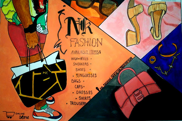
Graphic communication as the name suggests is communication using graphic elements. These elements include symbols such as glyphs and icons, images such as drawings and photographs, and can include the passive contributions of substrate, colour and surroundings. It is the process of creating, producing, and distributing material incorporating words and images to convey data, concepts, and emotions.
The
field of graphics communications encompasses all phases of the graphic
communications processes from origination of the idea (design, layout, and
typography) through reproduction, finishing and distribution of two- or
three-dimensional products or electronic transmission.
Graphic
Communications focuses on the technical aspects of producing and distributing
items of visual communication. This includes technical aspects associated with
the production of tangible items such as books, magazines and packaging, as
well as digital items such as e-newsletters, interactive apps, websites, video
and virtual reality applications.
Graphic
communication involves the use of visual material to relate ideas such as drawings, photographs, slides, and sketches.
The drawings of plans and refinements and a rough map sketched to show the way
could be considered graphical communication.
Graphic
Design focuses on development of concepts and creation of visuals. These
includes instruction regarding elements and principles of design, typography,
image editing, web and video production, etc.
Any
medium that uses a graphics to
aid in conveying a message, instruction,
or an idea is
involved in graphical communication. One of the most widely used forms of
graphical communication is the drawing.[3]
Another name
for Graphic design is ‘Commercial art’
Emphatically, below are some of the examples of graphic design works ;
- Poster/handbill design,
- Book cover/jacket design,
- Logo design,
- Shopping bag design,
- Product/Package design,
- Label design,
- Animation,
- Image/Video editing etc
Meanwhile, for you to communicate effectively with your graphic work, there are certain rules or principles that are to be put into
consideration and these rules are otherwise known as The Principles of Design and these are as follows;
• Proportion:
Proportion is the visual size and weight of elements
in a composition and how they relate to each other. In other words,
it is the relationship between one element and another.
• Movement
: This is the controlling of the elements in a composition so that the
eye is led to move from one to the next and the information is properly
communicated to your audience.
• Contrast:
Contrast is what people mean when they say a design “pops.”
It comes away from the page and sticks in your memory.
• Emphasis:
This is the aspect of your design you want to catch the attention of your audience
first. It also simply refer to as an area in a work of art
being highlighted and it is done to create a centre of interest.
• Repetition:
Repetition
unifies and strengthens a design. This is when a particular aspect of your
design is repeated more than once e.g choice of text.
• Balance:
Since you wouldn’t put all your furniture in one
corner of a room, so, you can’t crowd all your heavy elements in one area of
your composition. Examples of balance in design are Symmetrical Balance
, Asymmetrical Balance and Radial Balance
i.
Symmetrical balance is achieved by giving equal weight to elements across the
center-point of a composition. The center-point can be horizontal, vertical, or
diagonal. The result is a repetitive or mirrored (referred to as perfectly
symmetrical) image that appears to be completely equally balanced.
ii.
Asymmetrical balance occurs when the elements on a layout are different, but by
being equally weighted still feel balanced. There might be two elements with a
similar weight but different shapes, or one larger, heavier element balanced by
a couple of lesser focal points.
iii.
Radial balance often naturally occurs in the environment—ripples,
whirlpools, tree rings, and flower petals are all examples of this beautiful
form of balance. In graphic design, spirals are the best way to achieve radial
balance, and these can also be a useful technique for drawing the eye’s
attention towards the center of the image. Sales flyers and event posters often
use the principle of radial balance through circular frames or borders to draw
a customer’s attention to an offer or date.
------------------------------------------------------------------------
....Abiola M. Samson,
Cambridge Certified Art and Design Educator
Ohio State University, U.S.A Trained Teacher,
Official Judge, World COBIS Art Contest
British Council Trained Teacher


No comments:
Post a Comment